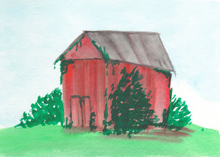
This is a little shed i came up with in my head, it's just barely holding i there, the roof is falling in and it has been overrun with foliage and such. I think the multiple layers on the side really helped give it the impression of age.
Yes, the skyscrapers may look like blue french fries, but i was attempting to give it a far away feel and almost have it fading into the background, hence their color. I also thought the trees in the foreground came out really well!
This is definetly my favorite out of this batch! The clouds came out great! I wanted this to look aged as well so i did a little lifting with a towel when it was still wet.
During class we had to do one of our paintings over again, i decided to do my little shed over again, i thought it came out alright, my green did not show up as well this time around on the shed.


No comments:
Post a Comment